

Contents
Unveiling Android 17: A Deeper Look at Its Visual Evolution
European Motorola Signature owners, and indeed Android enthusiasts worldwide, have eagerly awaited the stable release of Android 17. The wait is finally over, with the system now rolling out on various distribution channels. After spending several days exploring its new features, I’m genuinely impressed with the direction Google is taking its software design. While most visual enhancements are subtle, they collectively contribute to a more polished and user-centric experience.
Android 17 introduces refinements that enhance aesthetics and usability. From dynamic information displays to cohesive theming options, Google is clearly focused on making the Android experience more intuitive and visually appealing. For a comprehensive overview of the new functionalities and anticipated release schedules, you can refer to our detailed article: Android 17 Features and Release Date.
1. The “Dynamic Island” Experience on Android 17
One of the most surprising additions in Android 17 is a feature reminiscent of Apple’s Dynamic Island. While I’ve primarily observed it with Spotify and the active timer, this dynamic notification area subtly forms around the front camera cutout. It serves as a discreet reminder of ongoing background activities, such as music playback.
Tapping on this widget expands the media player, revealing the currently playing song and essential navigation controls. This intelligent use of screen real estate minimizes distractions while keeping critical information accessible, marking a significant step forward in Android’s user interface design. Google is also exploring other innovative features like priority charging to further optimize device interaction.
2. Subtle Blur Effect in Quick Settings
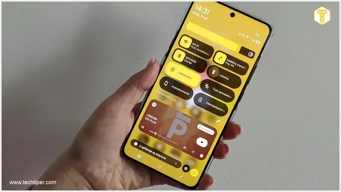
Frequent users of the quick settings panel will immediately notice a welcome change: a sophisticated blur effect on the background. This subtle visual enhancement accompanies the action of browsing through options, replacing the stark black background seen in Android 16 and older versions.
In my opinion, this blurred effect is significantly more visually pleasing, contributing to a modern and fluid interface. Furthermore, the quick settings buttons themselves have been redesigned to be more rectangular and slightly larger, greatly improving their readability and ease of interaction.
3. Monochromatic Icons for a Unified Aesthetic
For those who prefer a cohesive and clean look over a colorful mishmash of application icons, Android 17 introduces a brilliant solution: monochromatic themed icons. This feature allows your app icons to adapt their color scheme based on your wallpaper’s dominant hue. For instance, if your wallpaper prominently features green, all compatible icons will adopt a matching green tint, creating a perfectly harmonized home screen.
Enabling this feature is straightforward:
- Navigate to Settings.
- Select Home screen & lock screen.
- Choose Home screen options.
- Toggle on Themed icons.
Upon returning to your main menu, your smartphone will automatically adjust the color of your icons to align with the dominant color you’ve set in the Personalization section, offering an unprecedented level of visual customization.

Android 17’s visual novelties are a testament to Google’s commitment to refining the user experience. These seemingly minor adjustments make the smartphone feel more personal and integrated. In an era where our phones are arguably our most personal gadgets, such thoughtful design changes are highly appreciated. We encourage you to share your experiences with Android 17. Have these visual changes resonated with you, or do you prefer the classic icon layouts and system aesthetics? Your feedback is invaluable as Android continues to evolve.
Frequently Asked Questions (FAQ)
Android 17 introduces a dynamic notification area that appears around the front camera, similar to Apple’s Dynamic Island. It currently shows ongoing activities like music playback from Spotify and active timers. While its full potential is still being explored, it aims to provide glanceable information without interrupting your main screen activity.
Monochromatic icons in Android 17 enhance the user experience by creating a more visually cohesive and aesthetically pleasing home screen. They adapt their color to match your wallpaper’s dominant hue, reducing visual clutter and providing a unified design language across all compatible applications. This feature allows for a higher degree of personalization and a cleaner interface.
Android 17’s visual updates, such as the dynamic notification area, subtle blur in quick settings, and monochromatic icons, reflect Google’s commitment to Material You design principles. These updates emphasize personalization, adaptive interfaces, and a more intuitive user experience, aiming to make the operating system feel more ‘personal’ and responsive to individual preferences and contexts.
The availability of Android 17 depends on your device manufacturer and model. Google typically releases the stable version to its Pixel devices first, followed by other manufacturers who adapt the update for their respective devices. This process can take several weeks or months. It’s advisable to check your device’s system update settings regularly or consult your manufacturer’s update schedule.
Source: Original Research
Opening photo: Gemini
About Post Author