
Contents

Google Gemini Gets a Massive Interface Overhaul: What You Need to Know
Google has been rapidly evolving its AI ecosystem, and over the past few weeks, incremental changes have steadily made their way into the Gemini application. Now, reports indicate that early iOS users are getting their first hands-on experience with a completely overhauled Gemini app interface.

This update brings a cleaner, more intuitive user experience, stripping away unnecessary clutter while emphasizing multimodal AI interactions like voice and live video analysis. Let’s dive into exactly what has changed in this highly anticipated version.
A Fresh, Colorful, and Dynamic Interface
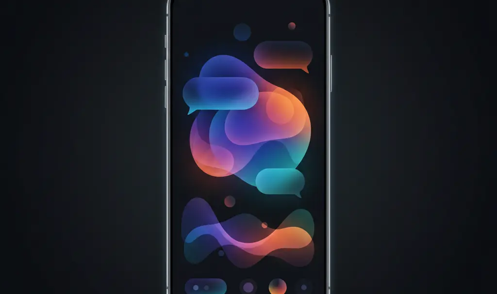
Opening the updated application confirms the details previously spotted in recent code teardowns. Google is bringing more vibrant color gradients to the forefront and fundamentally restructuring how you interact with the AI assistant.
The New Pill-Shaped Text Box
The most noticeable change is the transformation of the main text input field. It has abandoned its traditional rectangular look for a sleek, pill-shaped design. On Apple devices, this aligns beautifully with the iOS “Liquid Glass” visual aesthetic, offering a translucent and polished feel. However, when the update eventually hits Android, the layout is expected to feature a matte finish, adhering closely to Google’s cohesive Material 3 Expressive design language.
This layout shift builds upon recent user interface improvements, including the highly anticipated Google Gemini voice input redesign, making conversational AI feel more natural and native to your device.
Quick Access to Powerful Tools
The new pill-shaped chat bar is designed for speed and efficiency. It neatly houses three distinct action buttons:
- The “+” Icon: Positioned on the left, this button serves as a Google Gemini quick access update to your workflow, opening an attachment menu for tools like Video, Music, Images, and Photos.
- Microphone: Placed in the center, it allows for instant, hands-free prompt dictation.
- Gemini Live: Located on the right, this activates Google’s advanced real-time conversational mode, which can instantly react to audio, camera feeds, or on-screen information.
A Clutter-Free Home Screen Experience
Beyond the chat bar, the broader user experience has been refined. When Gemini processes a prompt, satisfying, fluid color gradients animate across the screen, adding a premium, dynamic feel to the app’s loading states. Additionally, the latest versions of the app are fully equipped to seamlessly generate popular document formats right from your phone.
The initial welcome screen has also been significantly decluttered to reduce cognitive load. Here are the key navigation adjustments:
- Simplified Greeting: The interface now only displays a clean welcome text. The bulky suggestion buttons for prompt templates—such as “Create an image” or “Help me study”—have been completely removed.
- Relocated Model Selector: The drop-down menu to switch between AI models (like Gemini Flash or Gemini Advanced) has been moved to the top-left corner of the screen.
- Hidden Account Switcher: In a surprising departure from the standard layout of most Google apps, the active account profile picture is no longer in the top-right corner. It is now neatly tucked away inside the app’s settings panel.
How to View Gemini’s Reasoning Process
For users who rely on Gemini for complex problem-solving or coding, understanding how the AI arrived at an answer is crucial. In the new update, viewing the AI’s step-by-step reasoning process requires a slightly different gesture. You must now tap and hold (long-press) the active chat bubble to trigger a context menu that reveals the backend thought process.
While the redesign is currently making waves among early iOS adopters, the broader tech community eagerly awaits its rollout to Android users. Once the update is widely available on Google’s native operating system, users can expect an even deeper integration with system-level features.
Frequently Asked Questions (FAQ)
Why did Google remove the suggestion buttons from the Gemini home screen?
Google removed the preset suggestion buttons to reduce visual clutter and provide a cleaner interface. This minimalist approach encourages users to naturally type or speak their custom prompts, rather than relying on restrictive, pre-set templates.
How do I access Gemini Live in the new app redesign?
Gemini Live can be activated directly from the new pill-shaped text box. You just need to tap the dedicated “Live” waveform icon located right next to the microphone to start a real-time, interactive conversation.
Where did the account profile switcher go in the updated Gemini app?
To simplify the top navigation bar, Google has relocated the account selection tool. Instead of sitting in the top-right corner of the home screen, your profile and account switching options are now located inside the app’s main settings panel.
Source: 9to5Google. Opening photo: Gemini