
Contents
Google Shoots Down ‘Liquid Glass’ UI Rumors Ahead of Android Show I/O 2026
The tech world is buzzing with anticipation as Google prepares for the Android Show: I/O Edition, scheduled for May 12 at 10:00 AM PT. Billed as an event that will introduce some of the most significant changes in the operating system’s history, fans are eagerly awaiting news on the upcoming Android 17 features and release date. However, a recent promotional teaser sent the internet into overdrive, sparking massive speculation about a radical visual overhaul.

The Transparent Bugdroid Teaser
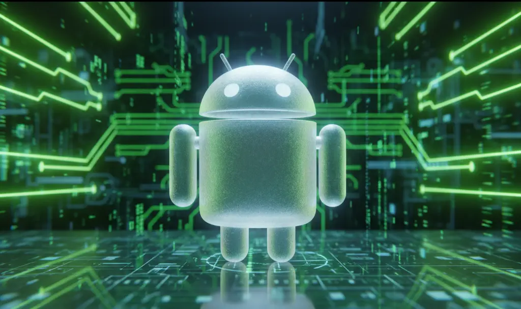
The catalyst for these rumors was a short teaser video released by Google. In the clip, the beloved Android mascot—affectionately known as the Bugdroid—momentarily transforms into a completely transparent figure. For many tech enthusiasts, this visual cue had only one logical meaning: Google was preparing to introduce a heavily glass-inspired, transparent user interface across its mobile ecosystem.
Almost instantly, social media platforms were flooded with theories. Users speculated that Android was pivoting away from its solid, flat design language toward a highly translucent aesthetic, widely referred to online as a “Liquid Glass” theme.
Google’s Official Stance: Rumors Denied
Just as the transparent UI theories began to be accepted as fact, Sameer Samat, the Head of the Android operating system, stepped in to set the record straight. Responding to inquiries from users on X (formerly Twitter), Samat clarified that the idea of Android introducing its own “Liquid Glass” interface is purely speculative.
According to Samat, there are absolutely no plans to implement a transparent, glass-like theme into the core OS. The transparent Bugdroid was simply a fun visual effect for the trailer, not a sneak peek at the next generation of Android design.
What to Expect Instead: Material 3 Expressive
If Liquid Glass isn’t on the menu, what will the next era of Android look like? Industry experts believe Google will continue to build upon the design language introduced last year: Material 3 Expressive.
Rather than relying on heavy transparency, Material 3 Expressive focuses on:
- Enhanced blur effects: Subtle background blurs that create depth without sacrificing legibility.
- Refreshed icon shapes: More dynamic and adaptive iconography that personalizes the user’s home screen.
- Vibrant color palettes: High-contrast color extraction that makes the interface pop while maintaining accessibility.
Learning from the Competition’s Missteps
Google’s hesitation to adopt a glass-heavy UI is likely a calculated decision, especially when looking at the broader smartphone market. Last year, Apple introduced its own “Liquid Glass” motif, which heavily relied on transparent elements. While visually striking, the design quickly drew criticism.
Many users found the heavy use of transparency to be visually overwhelming and difficult to read in certain lighting conditions, leading to widespread discussions about Apple’s Liquid Glass accessibility issues reported in iOS 26. The backlash was significant enough that Apple was forced to compromise shortly after launch. In the iOS 26.2 update, the Cupertino giant had to roll out new accessibility sliders, giving users the ability to manually reduce the transparency of lock screen elements and interface menus.
By sticking to the readable, accessible principles of Material Design, Google seems intent on avoiding these exact usability pitfalls.
Frequently Asked Questions (FAQ)
Why did the teaser feature a transparent Android mascot if a glass UI isn’t happening?
According to Google executives, the transparent Bugdroid was simply a creative visual effect used for promotional purposes to build hype for the Android Show I/O 2026. It was meant to showcase the flexibility of the mascot’s 3D redesign rather than hint at actual software interface changes.
How does Material 3 Expressive differ from a Liquid Glass interface?
While a “Liquid Glass” interface relies heavily on high-transparency elements that let background layers show through completely, Material 3 Expressive uses softer, opaque blur effects. Material 3 prioritizes high-contrast colors and subtle depth to ensure text and icons remain highly legible, whereas full transparency can often cause accessibility issues.
Source: Android Authority & Opening photo: Gemini