
Contents
Google Workspace Apps Get a Major Gradient Icon Redesign
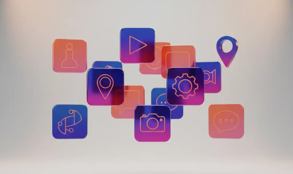
Google is continuing its ambitious initiative to refresh its smartphone app icons, and this time, the updates are rolling out with serious momentum. A massive leak has revealed nearly 20 new icon designs for Google’s most popular workspace applications. The new visual identity looks remarkably clean, polished, and surprisingly rich, introducing a level of depth that rivals the premium aesthetic typically associated with iOS devices.

Moving Beyond the Classic Four-Color Rule
For months following the initial design rollouts, international tech reporters have been working to uncover the full suite of Google’s new application icons. One of the most fascinating discoveries is that Google is stepping away from its traditional design constraints.
Historically, the tech giant insisted on cramming its iconic four colors (blue, red, yellow, and green) into almost every logo. This often resulted in cluttered designs that were hard to distinguish at a glance. The new redesign solves this by embracing rich, dynamic gradients and single-color palettes.
- Enhanced Depth: Even single-color icons, like those for Google Docs or Google Sheets, no longer look flat. They now feature subtle shadows and gradients that give them a distinct, 3D-like depth.
- Better Distinction: By abandoning the strict four-color rule across the board, individual applications are now much easier to identify quickly on a crowded home screen.
- Modern Aesthetic: The overall look is much more cohesive and tailored to modern smartphone displays.
Notable App Icon Changes: Drive, Meet, and Gmail
Several high-profile applications in the Workspace suite are receiving dramatic makeovers. Google Drive, for example, is completely dropping the subtle red accent from its bottom-right corner, opting for a cleaner tricolor look. This visual update perfectly complements the platform’s backend improvements, such as the recently introduced Google Drive AI ransomware protection.
Perhaps the most drastic transformation belongs to Google Meet. The video conferencing app is abandoning the multi-color approach entirely in favor of a striking, primarily yellow design. Meanwhile, Gmail’s redesign comes as no surprise; its evolutionary step follows the predictable pattern of previous updates, maintaining its familiar envelope motif while adopting the new gradient styling. As the interface evolves, users can also look forward to backend improvements, like the highly anticipated Google Gmail address change feature.
When Will the New Icons Roll Out?
Currently, these exciting visual changes are not yet visible on user smartphones. However, the timing of these leaks provides a strong hint about Google’s roadmap. With the highly anticipated Google I/O 2026 conference scheduled for May 19, 2026, it is highly likely that the corporation will use this global stage to officially unveil the new visual identity for its software ecosystem.
Frequently Asked Questions (FAQ)
Why is Google removing the four-color scheme from its app icons?
Google is shifting away from its strict four-color rule to improve user experience. Having every app icon feature the exact same colors made it difficult for users to quickly distinguish between apps like Docs, Meet, and Calendar. The new gradient designs prioritize quick recognition and modern aesthetics.
Will these new icons be available for iOS users as well?
Yes. While Google develops Android, its Workspace applications (like Gmail, Drive, and Docs) maintain a unified visual identity across all platforms. When the update officially rolls out, both Android and iPhone users can expect to see the new gradient icons.
Source: 9to5Google. Opening photo: Gemini.